Multigift
Multi-Gift
The Multi-Gift editor is oriented towards the personalization of any type of product: t-shirts, mugs, cushions, blankets…
You can see an example here.
It also allows creating products with more than one component (personalized products with more than one side or element), for example, a two-sided printable t-shirt, a two-sided customizable cushion, or double-sided greeting cards with different designs.
Each component or part of the product can have a different size, making it possible to offer a combined product where different personalized products are offered, for example, a cushion and a blanket.
Here is an example of using the Multi-Gift editor:
Price Model
This editor only allows using a fixed price per unit.

Components
Each product variant must have at least one component.
Depending on the product, we can use more than one component (personalized products with more than one side or element), for example, a two-sided printable t-shirt, or a two-sided customizable cushion.
Each component or part of the product can have a different size, making it possible to offer a combined product where different personalized products are offered, for example, a cushion and a blanket.
We can change the word “components” to one more appropriate for our product.
We will have to give each component a name and configure its size in millimeters.
In the trimbox section, we will configure the dimensions of the final page once printed and guillotined; this is what will be “delivered” to the final customer.

If necessary, in the Bleedbox section, we can configure the bleed in mm (cutting margins), and the width and height of the final product size are calculated on the screen before it is guillotined.
The final customer will always see if their image will be cut exactly as the design will look once cut.
Screen Design
This editor allows the use of graphic elements that can combine images or decorations to represent our product on the screen, helping the final customer see how the final product might look while they are editing it.
This representation is visual, and the images used as decorations will not be used for printing.
The system allows customizing a **scene background** and a **scene design** for the representation of our product.
Scene Background
We can configure a screen background; it allows configuring a solid color or an image.
If nothing is selected, the system uses a fine pattern as the scene background by default.

If an image is selected, you can indicate whether the image should fit, fill, or repeat as the background in the editor.
This image can be JPG or PNG; it is only representative on the screen, so it should not be a heavy image. It is recommended to use a solid background image at 72 dpi.

The scene background is designed to fill the entire editor area regardless of the size of the template’s scene design.
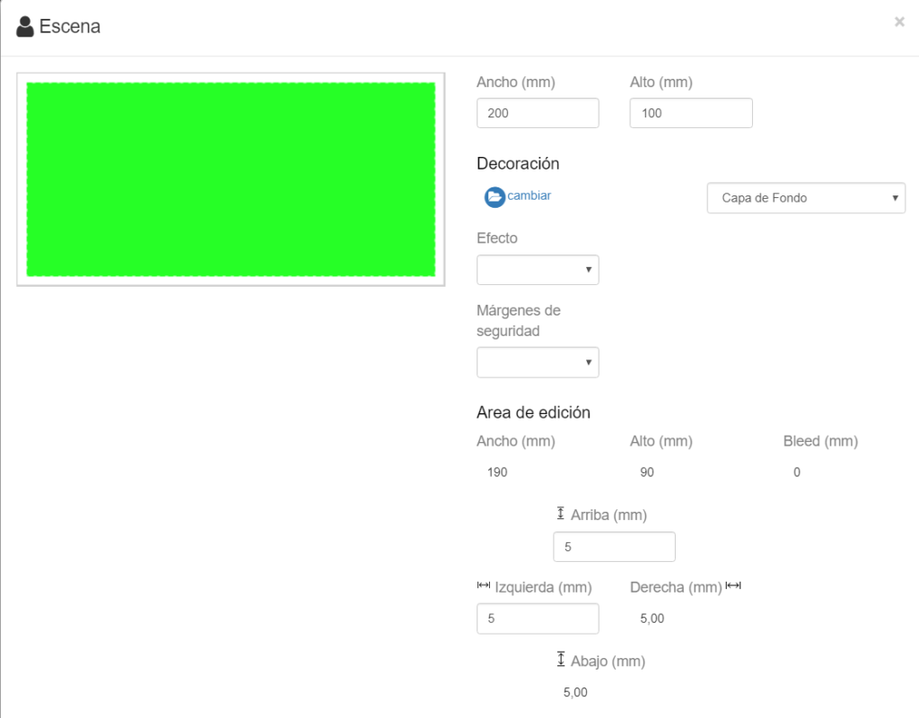
Scene Design
The scene design is used to make a representation, as realistic as possible, of our product on the screen.
Although the use of any image for the scene of the product we are going to configure is not mandatory, it is recommended to use it so that the final customer can see on the screen how the selected product may look when they are editing it with their images.
For products where the representation of the product is the printed design itself (e.g., greeting cards, postcards, single-sided calendars, etc.), it is not necessary to use an image as the scene design.


The scene design shows a green area, proportional to the configured product size, which the system uses to detect the area within the product where the printable design that the customer can edit will be displayed.
When the user edits the product, the editor removes this green area and substitutes it with the printable design chosen by the customer.
For the product representation, PNG images with a transparent hole can be used. This hole can have the required shape (round keyring, heart-shaped cushion, etc.) and must have the proportional measurements of the final product.
When adding this PNG as a scene design, the system will detect the transparent hole to directly place the green area where the designs to be printed will be located.
In products where the design area can be located on top of the image, such as on a t-shirt or a cushion, it is not necessary to use a PNG with a transparent hole.
When starting a new design, the system allows “importing” or “creating.”
Import
This option imports the graphic material that has been managed in the Materials section.
This allows the product to be displayed in a more realistic way.
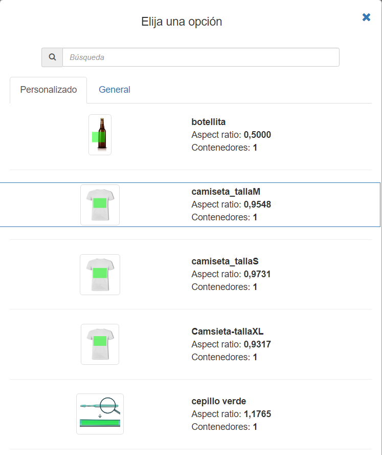
Create
When creating a scene design, a new menu will be shown where this Scene can be created for this specific product, without having to manage the product through the image bank of the Materials section.
This option is only permitted for Distributors; however, if you do not see it available, you can contact us at soporte@imaxel.com and we will take care of uploading the file you provide us.
Printable Artwork (Printable Designs)
In this section, we can create as many different designs as we want to offer in the product variant, so that the customer can select, edit their images, and which we will finally receive with the order for printing.
It offers the possibility of creating parameterized designs, collage type, based on rows and columns, or importing prepared designs in SVG format, which we will have previously uploaded to the Materials folder of the backoffice.
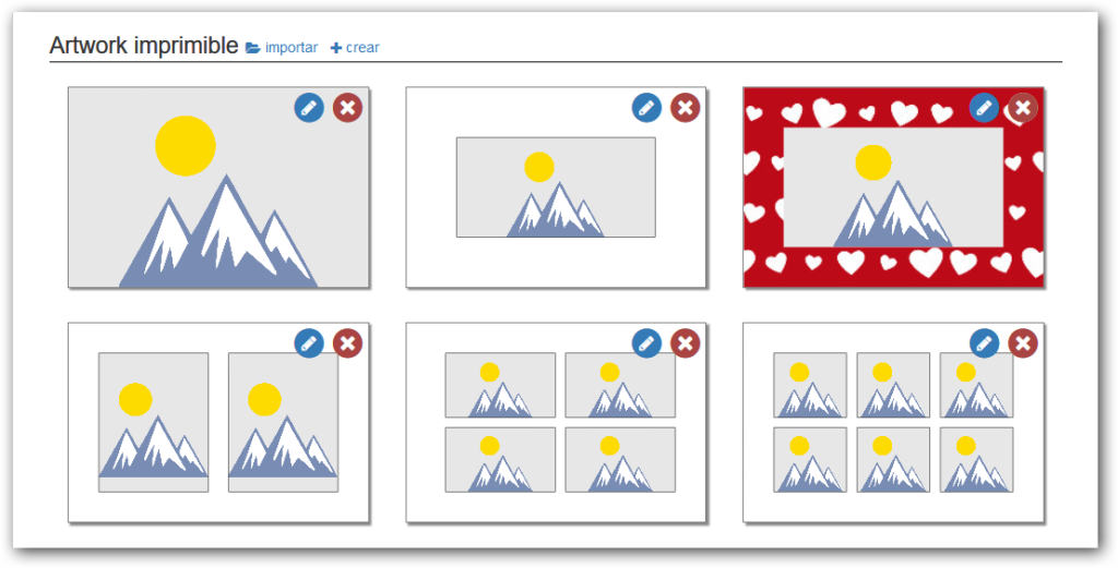
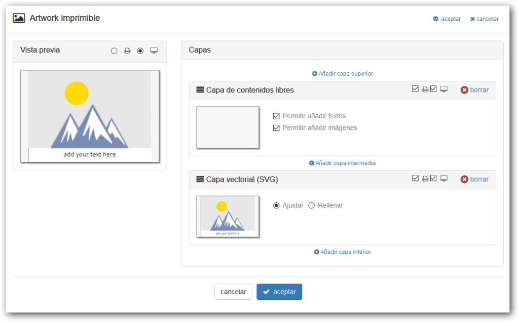
The creation of printable artworks (designs) is based on the concept of layers.
To create a new artwork, we can use the “Import” and “Create” buttons in the “Printable Artwork” section of each variant.
Create
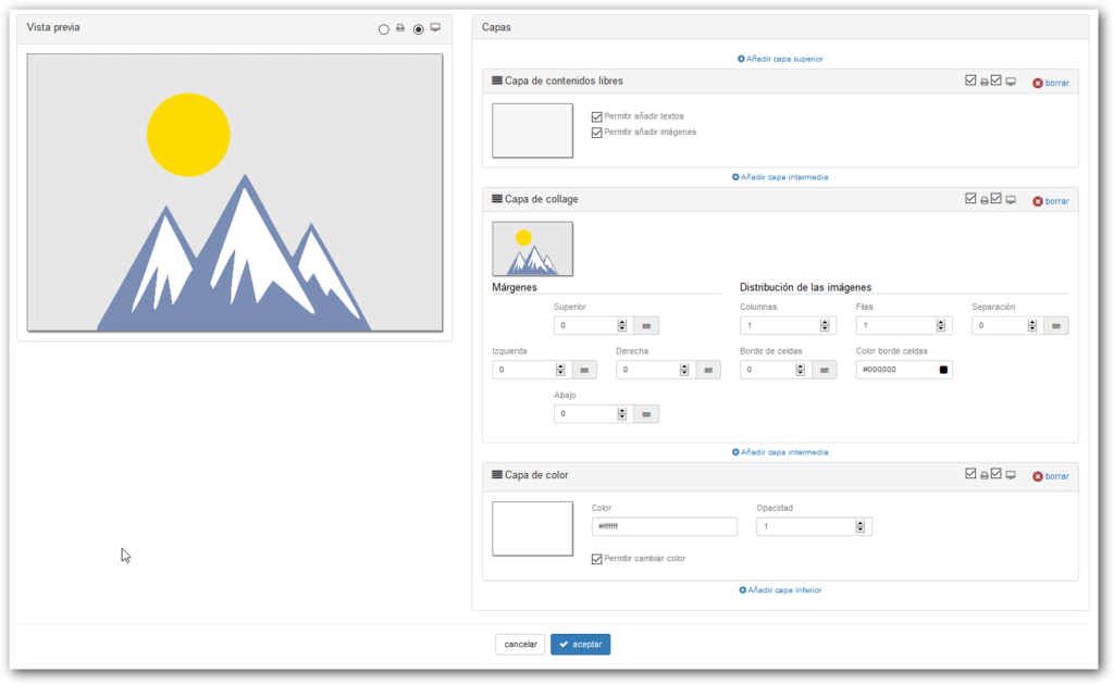
If we select “Create“, the initial design has 3 layers: a Free Content layer on top, an intermediate Collage-type layer, and a Color-type layer at the bottom.
There are certain restrictions on layer-based designs:
- The design must have at least one layer.
- There can only be 1 “Free Content” layer.
- There can only be 1 layer of type “Collage” or type “Vector SVG”.
The “Free Content” layer cannot be below the “Collage” or “SVG Design” layer.
When creating a new design, the editor is organized on the screen in two columns:
- Preview: Offers a selector to see which design will be shown on the screen and which design will be sent to the printer.
- List with all the design layers
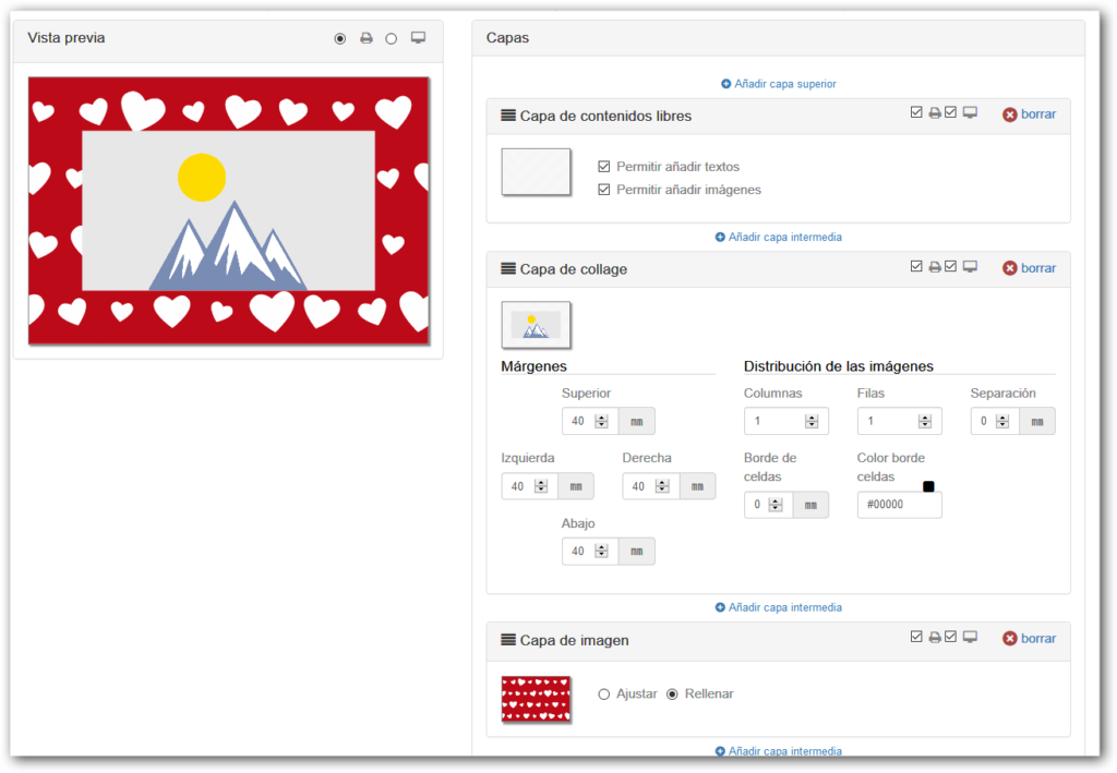
Design Layers
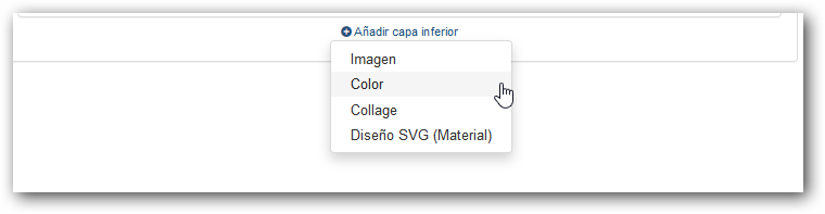
The layers are shown from top (the superior) to bottom (the inferior). A button is shown above and below each layer to add a new layer in that position.
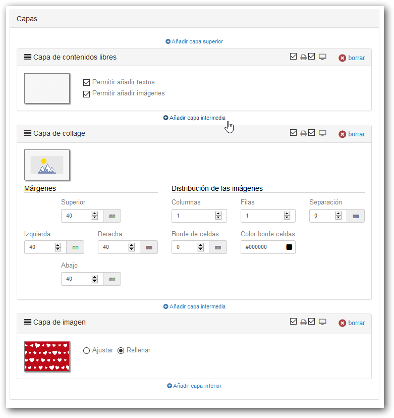
By pressing one of these buttons, a menu will be shown with the possible layers that can be added.
A bar is shown on each layer with the title of the layer type, a printer icon, and a screen icon.
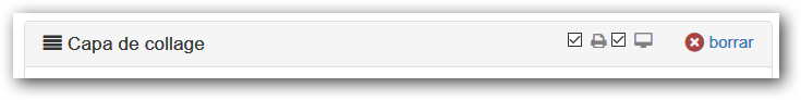
- Printer Icon: If checked, the layer will be printed.
- Screen Icon: If checked, the layer will be shown on screen in the editor.
- Delete: Allows deleting the layer. If there is only 1 layer in the design, the “Delete” button is not shown.
The different types of layers available are:
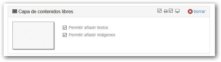
Free Content Layer
Layer in which the end-user freely introduces content, texts, and images.
- We can only have one free content layer in the design.
- This layer always has the printer and screen options checked.
- The “Free Content” layer cannot be below the “Collage” or “SVG Design” layer.
- It can be indicated which elements we allow the user to add (Texts and/or Images).
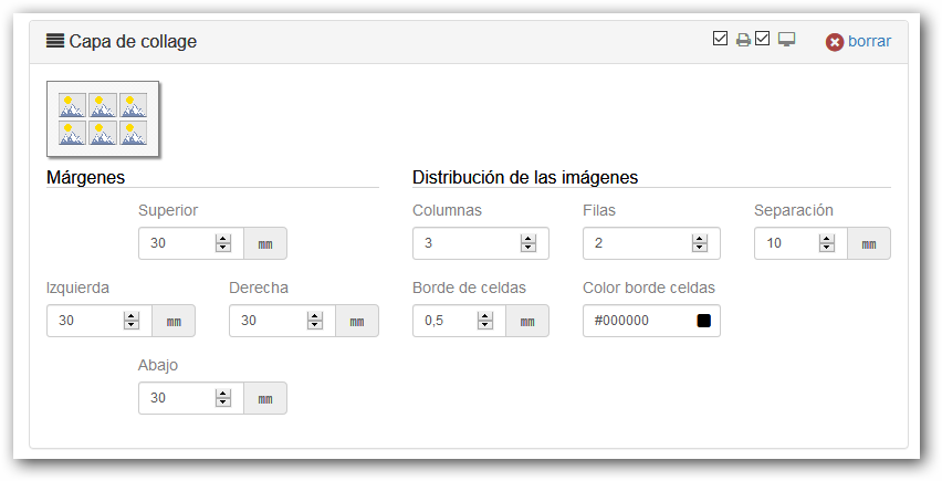
Collage Layer
Parameterized design layer where the distribution of images is based on rows and columns.
- We can only add one “collage” type layer in the design.
- This layer always has the printer and screen options checked.
- It allows indicating the margins of the images with respect to the background, the separation between cells, and the thickness and color of the cell border.
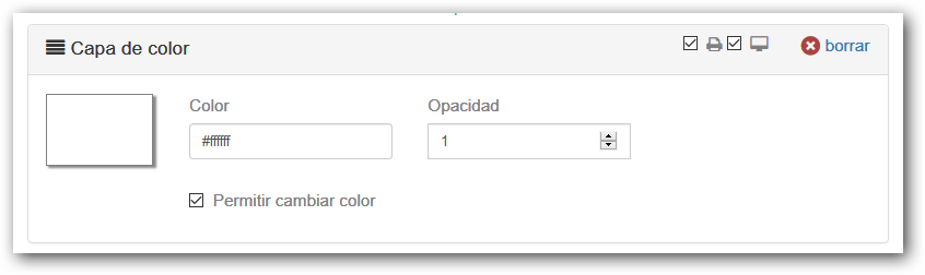
Color Layer
Layer that fills the design area with the indicated color.
- Allows selecting a color, indicating the opacity (1=opaque, 0=transparent).
- Checking whether we allow the end-user to change the background color.
- This layer always has the printer and screen options checked.
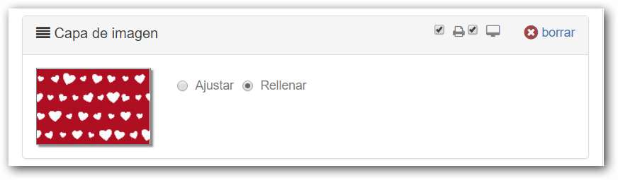
SVG Vector Layer
Allows importing an SVG design, which we will have previously uploaded to the Materials folder of the backoffice.
- Allows indicating whether the design fits or fills the area.
- Allows indicating whether the user can change the background color (in the case that the SVG design has a rectangular zone marked with the tag #IMX\_BACKGROUND).
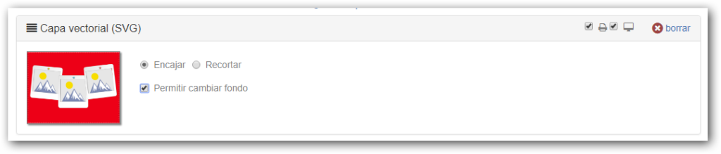
Image Layer
Fills the design area with the indicated image.
- JPG or PNG images can be used, and it is advised not to exceed 10 Mb.
- Allows indicating whether the image fits or fills the design area.
Import
When starting a new design, the system allows “importing” or “creating.”
If “import” is chosen, a window is shown that allows importing an SVG design, which we will have previously uploaded to the Material folder of the backoffice.
Once the design is imported, the initial design has 2 layers: a free content layer on top and the SVG design layer underneath.
If we select “Create“, the initial design has 3 layers: a Free Content layer on top, an intermediate Collage-type layer, and a Color-type layer at the bottom.
There are certain restrictions on layer-based designs:
- The design must have at least one layer.
- There can only be 1 “Free Content” layer.
- There can only be 1 layer of type “Collage” or type “Vector SVG”.
- The “Free Content” layer cannot be below the “Collage” or “SVG Design” layer.